
Why do we want to measure the 6 gases we do?
The Greenhouse Gas Measurement Lab measures four greenhouse gases and two other trace gases. Each air sample is measured by four specialized machines to obtain measurements for the six gases. Why these six gases? A look at each gas should help with this!
Once you know the key features of the greenhouse gases that we measure, let’s go to the measurement lab and see how we measure them.
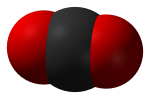
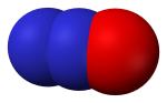
Carbon Dioxide (CO2)
This is probably the gas you have heard a lot about. Well… so what’s the big deal?
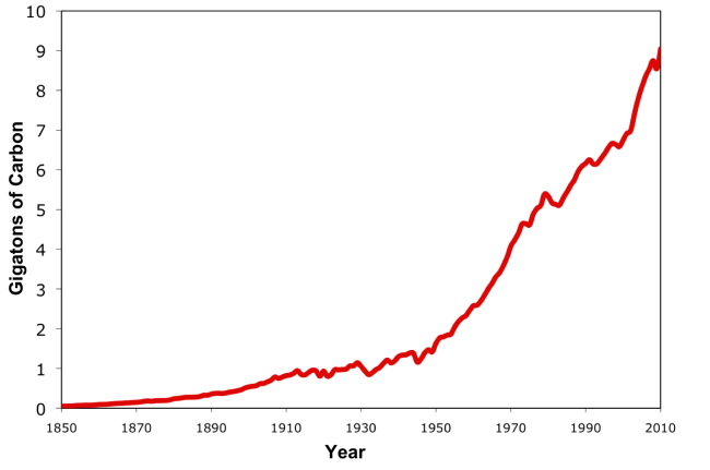
Source: CDIAC and BP, 2011
In 2010 about 9 Giga-tons of Carbon (GtC) were emitted from burning fossil fuels as 33 Giga-tons of CO2 gas.
How much is 9 Giga-ton? 9 billion tons or 9,000,000,000,000,000 grams, or 19,800,000,000,000 pounds.
Can you imagine…9 Giga-tons is the weight of about 132 billion people. The amount of carbon we are putting into the atmosphere each year is equal to 20 times the weight of the current world population.
At CCGG, we measure CO2 at sites all around the world, to build a picture of how much CO2 is in the atmosphere. The key questions are: How much carbon dioxide is in the atmosphere? What controls the amount of carbon dioxide in the atmosphere? How we can predict how carbon dioxide concentrations might change in the future?

This is a plot of the measurements collected on top of a mountain at a clean air site in Mauna Loa, Hawaii. The y – axis (vertical axis) on this graph is given in parts per million (ppm) or one mole of CO2 per million moles of gas. A mole, no not the animal, is 602,000,000,000,000,000,000,000 molecules. (A molecule is a group of atoms bonded together that represents the smallest unit of a chemical compound or element). Scientists use the unit mole as a way of comparing amounts of different things. The increase of 74 ppm from 316 in 1959 to 390 ppm in 2010 is clear. Also noticeable are the seasonal variations in each year. Carbon dioxide is lower in the northern hemisphere summer when plants use CO2 from the atmosphere for photosynthesis and higher in the winter when little photosynthesis occurs, and respiration releases CO2 back to the atmosphere. The seasonal trend correlates to the northern hemisphere seasons, because the majority of the land and plants are in the northern hemisphere. We can see these trends in the rest of the world as well.
This moving CO2 graph created using data measured in the Greenhouse Gas Measurements Lab begins in 1979 and has an x-axis of latitude, and a y-axis of ppm of CO2. You can see as the time continues, the whole graph increases. The big blue dot is representative of the average over Antarctica, and steadily increases. The big red dot is Mauna Loa Hawaii, the same location as the previous graph. In the southern hemisphere, there is almost no seasonal cycle, and the average CO2 concentration is a little bit lower than the concentration in the northern hemisphere. Almost all of the fossil fuel CO2 is produced in the northern hemisphere and it takes about a year for that newly added CO2 to mix into the southern hemisphere. The further north you look the more the seasonal oscillation is noticeable.
There are about 5,100,000,000,000,000,000,000 grams of air in the atmosphere, and using unit conversions and some algebra, we know that 9 Gigatons of Carbon per year is approximately the same as 4 ppm per year. But wait, the increase every year in these graphs is currently only about 2 ppm, or 4 gigatons. That’s roughly half of the 9 gigatons of fossil fuel CO2 emissions. Where did the other half go? The carbon cycle consists of 3 major reservoirs: the atmosphere, the oceans, and the terrestrial biosphere (land plants and animals).
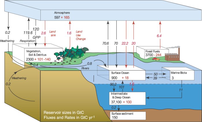
Half of the fossil fuel CO2 that seems to have disappeared from the atmosphere ended up in the oceans and terrestrial biosphere. The story of how and why this happens is the subject of much scientific research. Understanding where and why this happens is key to answering the questions above. CCGG’s global measurements of CO2 concentrations are used to help answer these questions. You can learn more about how our measurements answer these questions in the Carbon Cycle Toolkit (Overview in not-too-technical terms) and Carbon Cycle Science pages (scientific description).
You can actually view graphs of the measurements made at CCGG.
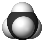
Methane (CH4)
The story of methane goes a bit differently. Methane is a colorless, odorless, combustible (it burns) gas with many natural and anthropogenic sources. Natural sources of methane include wetlands, termites, and oceans, while human sources include rice paddies, ruminant animals (like cows), and natural gas (a fossil fuel).

On average, each molecule of methane remains in the atmosphere for 9 years, a much shorter lifetime than CO2 in the atmosphere and oceans, because it is destroyed by a chemical reaction in the atmosphere with hydroxyl radical (OH). Methane is currently the 2nd largest greenhouse gas contribution to radiative forcing. Even though the concentration of methane (about 1.8 ppm) is small compared to CO2, it is 25 times more powerful per kilogram of gas. Overall methane contributes about 0.5 W/m2 to the greenhouse effect, about 28% of the effect of CO2.
So what’s the big deal?

These are measurements of methane made at CCGG from the sample flask sites. The y – axis (vertical axis) on this graph is given parts per billion (ppb). (Parts per billion is another way of writing the number of moles of CH4 per billion moles of air). Methane increased steadily from 1750 to the 1990s, when there was a brief period of constant concentrations, but methane concentrations are now increasing again.
Work is still being done to more accurately pinpoint how much the different sources of methane contribute to the overall atmospheric concentration and how those sources change through time. Research into the finer details of the reaction of methane with OH is also being done to determine how the methane lifetime changes in time and space.
Methane concentrations started increasing again in 2007, after many years of stable values. Why? Could it be that global warming has caused wetlands in the Arctic to warm and release more methane than before? Or perhaps something changed in the tropics to cause more methane to be released from wetlands and rice paddies there? CCGG’s global methane measurements have been used by researchers all over the world to help understand this.
Nitrous Oxide - N2O
Next time you’re at the dentist, take a moment to think about nitrous oxide, better known as laughing gas. Believe it or not, N2O is also a powerful greenhouse gas! Though its concentration at 0.32 ppm is much smaller than CO2 and CH4, it is 200 times more powerful than CO2 if the same amount of gas was released at the same time. N2O has a long lifetime of 120 years. This means that on average, N2O that is released stays in the atmosphere for longer than most of us are alive.
The primary source of human N2O emissions is fertilizer used to help crops grow in the agriculture industry. As you giggle away in the dentist’s chair you’re contributing too, but that turns out to be a very small amount compared to the agricultural emissions. There are also natural sources of N2O, including the soil and the ocean. N2O is removed from the atmosphere by a chemical reaction in the stratosphere. In the stratosphere, N2O reacts to form harmless N2 and O2, but sometimes it reacts with an excited oxygen atom to make nitric oxide (NO), which affects the amount of ozone in the stratosphere, and can also react with oxygen to form Nitrogen dioxide (NO2), a brown, toxic pollutant.

CCGG’s measurements of N2O in the atmosphere show that unlike many other gases, N2O is quite similar throughout the globe. This is because it has such a long lifetime, and the sources are small. CCGG’s measurements are made at clean sites far from any sources, and are used as background in more detailed studies.
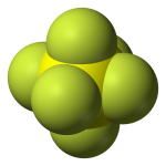
Sulfur Hexafluoride – SF6
Sulfur hexafluoride is entirely manmade, and used mostly to stop sparks (preventing fires) inside transformers and other electrical equipment in the electric power industry. Over time, it leaks into the atmosphere. Current concentrations of SF6 in the atmosphere are small, but SF6 has a lifetime of 3,000 years, and per kilogram it is 36,000 times more powerful than CO2 as a greenhouse gas!! SF6 does not have a sink, due to its inert properties, so measuring SF6 has another purpose as a tracer gas.

CCGG’s measurements of SF6 show that it is increasing in the atmosphere. Since we know that it does not react, the rate of increase tells us how much is being emitted, globally. Under the Kyoto Protocol, governments report how much SF6 is emitted from their country. Current rates of increase in the atmosphere are higher than expected from these reports. Researchers at CCGG used the measurements from around the globe to help pinpoint where the extra emissions are coming from.
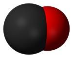
Carbon Monoxide – CO
Carbon monoxide is a colorless, odorless, toxic gas. Although CO is not a greenhouse gas, itself, it is important that we measure it for many reasons:
- Like CH4, CO reacts with the hydroxyl radical (OH). More CO in the atmosphere means that there is less OH available to react with CH4. This limits the effectiveness of the key sink for CH4, meaning that excess CO can contribute to increases in CH4.
- Like SF6, CO is tracer gas and is used to help identify different sources of CO2. The primary source of CO is combustion, but some CO is also produced by oxidation of volatile organic compounds. (The majority of volatile organic compounds are created by plants, but a small portion is also created by industry.) When anything burns, it produces a lot of CO2 and a small amount of CO. Have you ever noticed the yellow flame when you burn wood in a fireplace? A yellow flame means that the burning is inefficient and produces lots of soot and CO. On the other hand, when you run a gas barbeque you see a hotter, more efficient, blue flame which produces very little CO. A natural source, like a forest fire, is inefficient and produces a relatively large amount of CO. Large electrical power plants that burn coal and natural gas are very efficient, and they produce almost no CO. Cars and other vehicles are less efficient and produce and intermediate amount of CO. Knowing the amount of CO produced by each source, we can help distinguish between different CO2 sources by measuring and comparing the relative amounts of CO and CO2 in the atmosphere.
- It’s poisonous. When the concentration goes over about 35 ppm, it can kill us. I am sure you have heard of carbon monoxide detectors for homes. These alarms alert you if the concentration of CO in your home is too high. Take a look at the graph below. What are the typical atmospheric CO concentrations?

Atmospheric CO concentrations are much, much lower than the toxic level, but it’s still important to keep an eye on it, don’t you think?
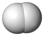
Diatomic Hydrogen – H2
Although it does not directly absorb infrared radiation, hydrogen is another gas which reacts with the hydroxyl radical (OH), and therefore decreases the effectiveness of the CH4 sink.
Concerns over H2 are now shifting towards the future. Even with discussions of hydrogen power, leaks in production and transport will still exist, and it is important to understand how hydrogen interacts in the atmosphere and what increasing hydrogen amounts could do to other gases such as CH4.

 Previous