June Heat in Colorado - Why Is It so Hot?
Disclaimer: This draft is an evolving research assessment and not a final report. The analyses presented have not yet been peer reviewed and do not represent official positions of ESRL, NOAA, or DOC. Comments are welcome. For more information, contact
Dr. Martin Hoerling (martin.hoerling@noaa.gov)
A string of record breaking maximum temperatures and numerous fires and almost no precipitation in Colorado during the month of June 2012 had people wondering - What's up with the weather? For example Boulder, Colorado had the hottest average maximum temperature (91.2° F) for the month of June. The period from March to June was the driest in the city's weather records dating back to 1894. Is this natural variation? Is it climate change? Has this happened before? The pages below give some background information to help answer these questions.
- Regional Trends
- Colorado Story
- Historical Analog
- Colorado Fires
- Is This Climate Change?
- Additional Information

Given the regional context, what has been happening in Colorado?
Images generated by the High Plains Regional Climate Center
Observations
Over the past year, Colorado has seen drier and warmer than normal conditions. Click on a station in the map (or the arrow next to the station name) to see the time series for July 2011 to July 2012 for that station.
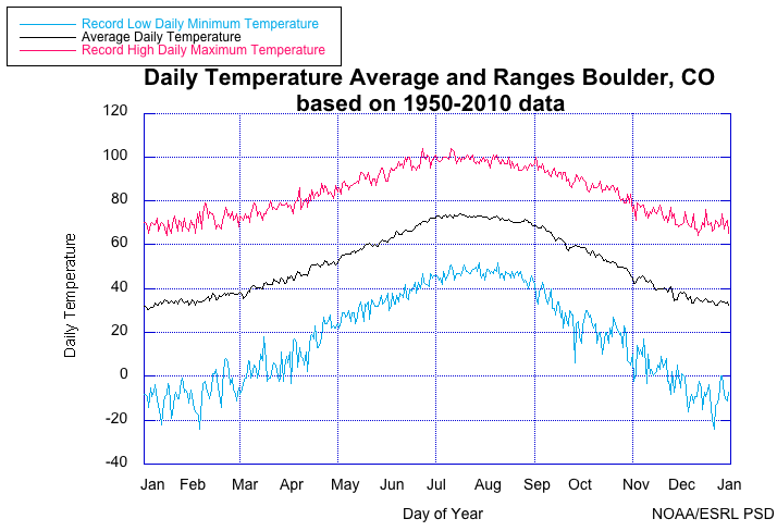
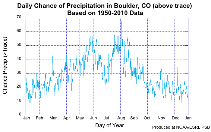
Climatology for Boulder, CO
The plots below show the record maximum, minimum and average temperatures (left) and the chance of precipitation (right) for Boulder, Colorado from 1950 to 2010. Some things to note about the graphs below in relation to 2012. Historically, the maximum high temperatures of the year (> 100 °F) occur in late June and early July. Also, note that there is a climatologically normal period of relatively dry weather at the end of June and into the beginning of July during the period between the usual wet spring season and the onset of the July-August monsoon season.
 |
 |
Temperature Trends
Since 1901, both the maximum and minimum June temperatures have risen. Maximum temperatures have generally increased by 1-1.5 degree Celsius (2-3 degrees Fahrenheit). Minimum temperatures have risen more in western Colorado than the
east.


Precipitation Trends
Trends in precipitation are most important on shorter timescales. In the image on the left below, one can see that over the past 2 years, the southern states have had generally dry conditions while the northwest and northeast have been wetter than average. This is consistent with the precipitation pattern associated with La Niña - a cooling of the Eastern Pacific Ocean. As described in the Southwest Climate Assessment: "It is likely that most of recent dryness over the Southwest is associated with a natural, decadal coolness in tropical Pacific sea surface temperatures." (Hoerling et al, 2012)


Is there an historical analog?
In 1956, Colorado experienced a dry spring and a hot June. This was also a La Niña year as was the case in 2012 until late spring. The maps below compare the patterns of 1956 to those in 2012. These maps show a similar story in terms of circulation patterns and their effects.
Temperature


Precipitation


500 millibar heights (May-June)


Fires in Colorado
On June 26, 2012, lightning sparked the Flagstaff Fire above the NOAA building in Boulder, CO. The timelapse video below was taken by Dustin Henderlon shows the view from Boulder from 3 pm, June 26 to 10 am June 28th.
How does this compare to the historical record
According to the National Interagency Fire Center, through July 3, the acreage burned and number of fires are
- Acreage - 2,199,484
- Number - 28,420
- Acreage - 2,461,795
- Number - 39,502
- Acreage - 3,779,450
- Number - 57,609
Other links of interest
Politics of Fire and Ice by Chris Mooney
Andy Revkin's Dot Earth blog
Given the trends of warmer temperatures and the 2012 drought conditions in Colorado, one might ask:


- How have changing conditions over the Southwest been symptomatic of human-induced climate change?
- Is recent Southwest dryness a symptom of human-induced climate change?
Observed vs. CMIP5
The CMIP5 (Coupled Model Intercomparison Project Phase 5) dataset is a set of coordinated model experiments from 20 climate modelling groups around the world. This ensemble of different solutions can be used to examine the observed change in temperature with model simulations that include forcings due to increasing CO2. In the plot below, the observed temperature trend aligns with the rise in temperature due to human-induced forcings. However, the observed change in precipitation (drying) is not well simulated by the CMIP5 model runs.

Observed vs. AMIP
The AMIP (Atmospheric Model Intercomparison Project) is a standard experimental protocol for global atmospheric general circulation models (AGCMs). The AGCMs
are constrained by realistic sea surface temperature and sea ice so the output is forced by ocean surface processes instead of greenhouse gasses. In the plot below, the precipitation much more closely matches the AMIP solutions, indicating that the primary driving force of the reduced precipitation is a natural variation of the ocean related to El Niño/La Niña cycles.

- Hoerling, M.P., M. Dettinger, K. Wolter, J. Lukas, J. Eischeid, R. Nemani, B. Liebmann, and K. E. Kunkel, 2012. Evolving Weather and Climate Conditions of the Southwest United States. Chapter 5 in Garfin, G., Jardine, A., Merideth, R., Black, M. and Overpeck, J., (eds.) Assessment of Climate Change in the Southwest United States: a Technical Report Prepared for the U.S. National Climate Assessment. Tucson, AZ: Southwest Climate Alliance. (in press)
- McQueen, H. R. and H. J. Shellum, 1956: The Heat Wave From the Intermountain Area to the Northern Great Lakes, June 9-13, 1956. Mon. Wea. Rev., 84, 242–251.
- Christian Science Monitor, Death Valley heat in Kansas? How the end of June got so hot